Foundations
Imagery and icons
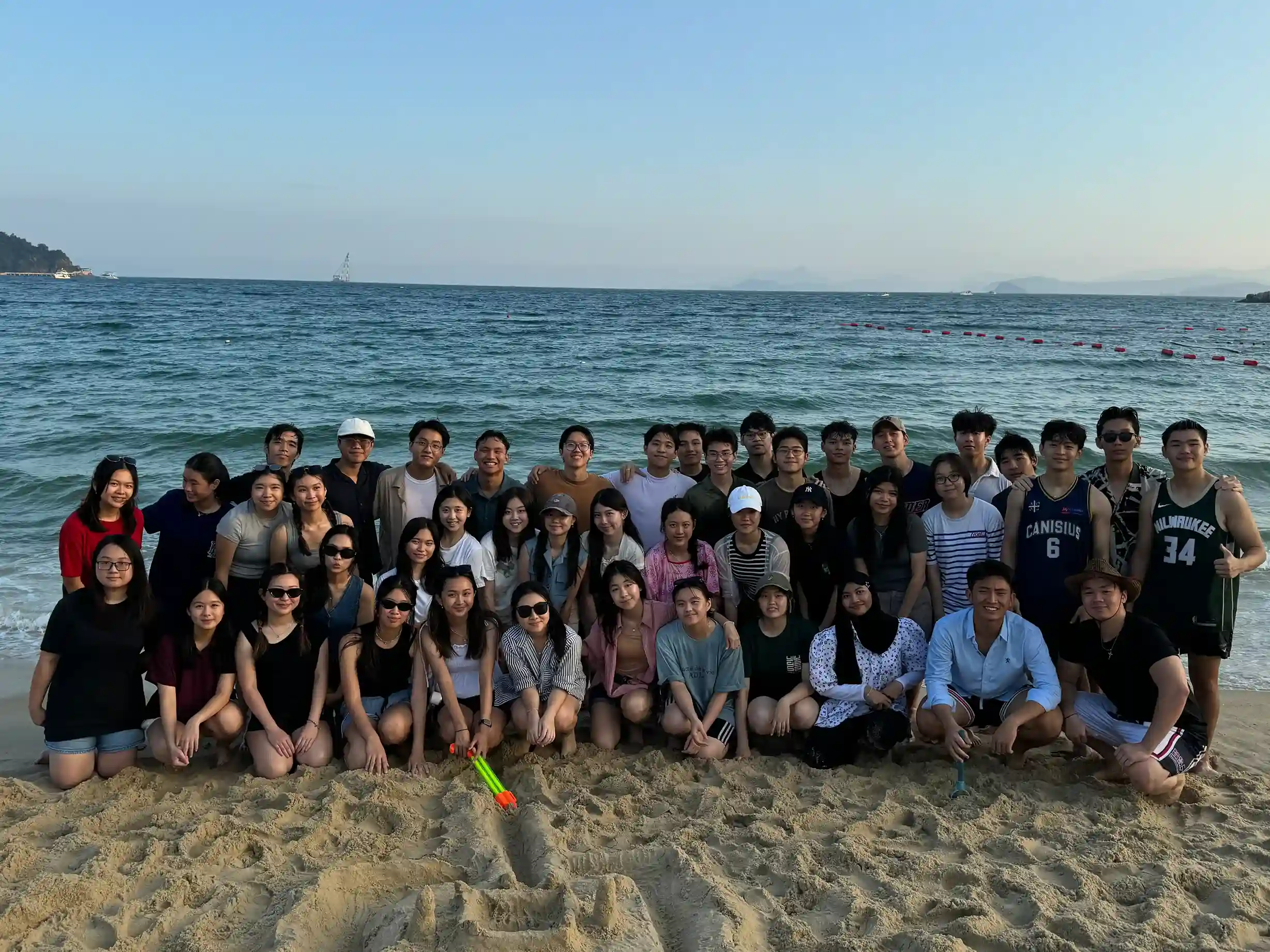
Photos of real members, events and places in Shenzhen, in natural color with nothing printed on top. Icons are for function only.
Photography
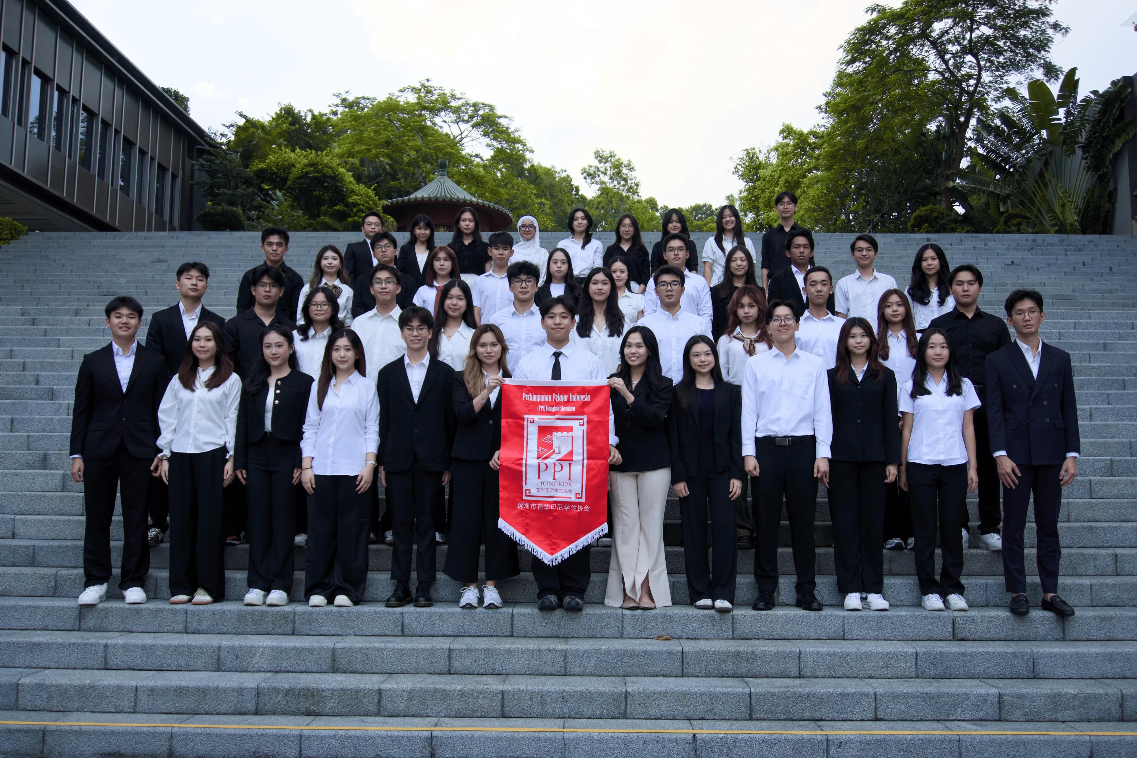
- Real only: members, events, campuses, Shenzhen. No stock, AI images, 3D renders or illustrations standing in for people.
- Natural color. No darkening, duotone, overlays or filters.
- No text on photos. Titles and captions sit beside or below; only a status badge may sit over a photo.
- Captions read like a station label: what happened, where, when, and who took it (“Photo: …”).
- Portraits are raw 4:5 photos with no names baked in. Names, roles and campuses are live HTML.
- Alt text describes the scene in the page language. Thumbnails whose title already names them use
alt="". Never “image of…”. - Delivery:
next/imagewith asizesvalue matching the layout;priorityonly on the hero.
Don’t
Darken a photo and center a headline, a subtext and two buttons on it.
Do
The photo in natural color, with the heading beside or above it.
Aspect ratios
Crop with object-cover and a stored focal point. Never crop through a face at the edge.
The PPI mark
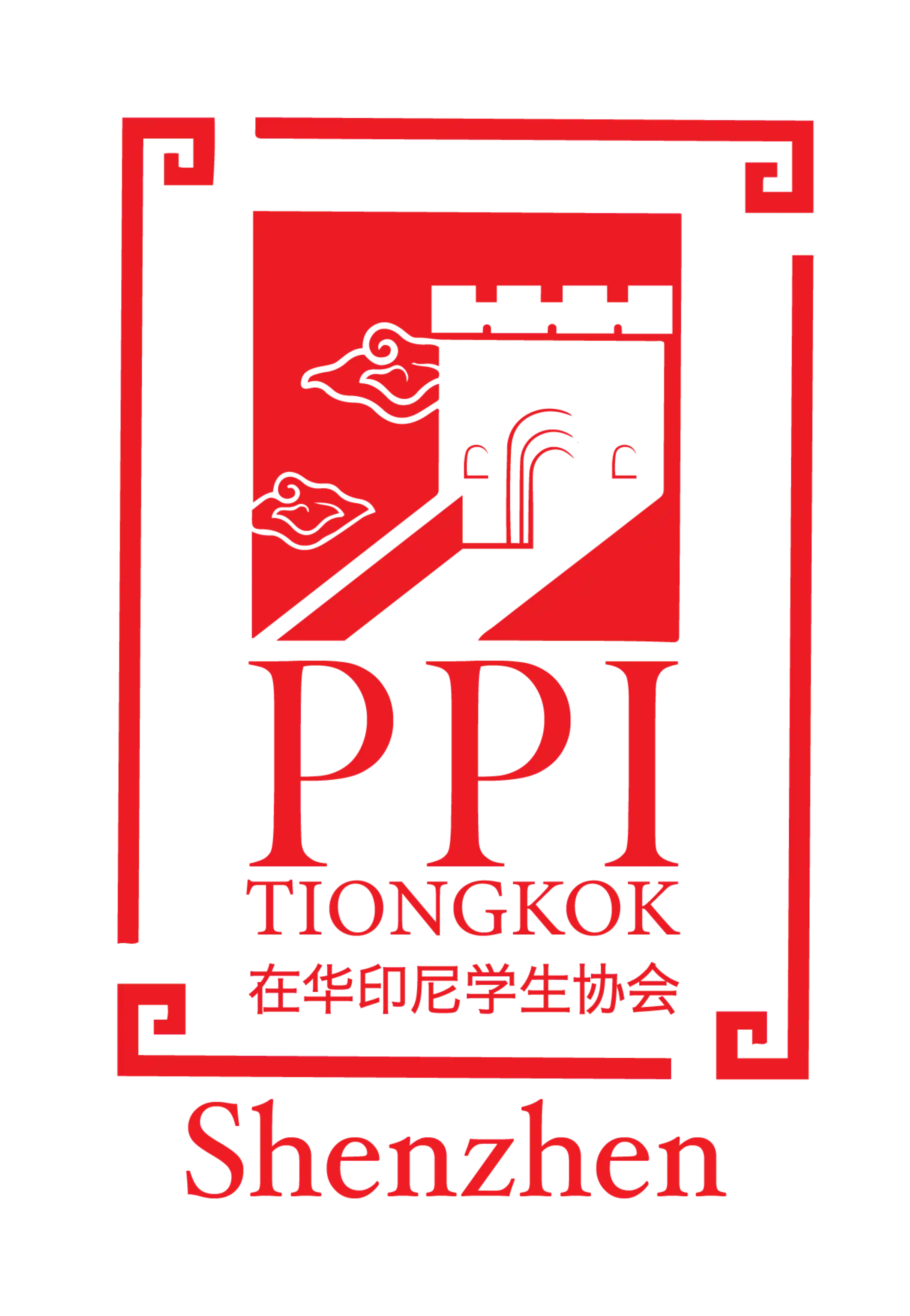
Red on light backgrounds, white on dark and tone-ink. The PpiMark component switches through the theme tokens. Never on photos, never recolored, never redrawn as a line badge. The yearly cabinet mark sits next to it in the header, after a thin divider, and never changes tokens, fonts or components.

Show codeHide code
<PpiMark className="h-24" />The repository has only raster versions of the mark. Tracing an SVG is a follow-up.
Icons
Phosphor, through shadcn's iconLibrary: "phosphor". Server Components import from @phosphor-icons/react/ssr, Client Components from @phosphor-icons/react. bold at 16px, regular at 20 and 24px, always currentColor. Function only: no metro or train icons as decoration.
ArrowRightIconArrowUpRightIconArrowLeftIconCaretDownIconCaretRightIconListIconXIconCalendarBlankIconClockIconMapPinIconGlobeIconUserIconDownloadSimpleIconUploadSimpleIconCopyIconTrashIconMagnifyingGlassIconSignOutIconImagesIconQrCodeIconEnvelopeSimpleIconCheckIconCheckCircleIconWarningIconWarningCircleIconInfoIconCircleNotchIconSunDimIconMoonIconInstagramLogoIconTiktokLogoIconLinkedinLogoIconYoutubeLogoIconWechatLogoIcon
| Size | Weight | Where |
|---|---|---|
| 16px | bold | Inside small buttons, chips, error messages |
| 20px | regular | Buttons, menu items, notices |
| 24px | regular | Icon-only buttons, accordion carets |
Icon-only buttons need an aria-label in the page language and a hit area of at least 44 × 44px. Decorative icons are aria-hidden.